I recently bought a bunch of 1977 OPC Jays on COMC. While looking through the cards, it's interesting to see how many of them are different from the Topps cards from 1977..
But first... Day two of the Card Challenge..
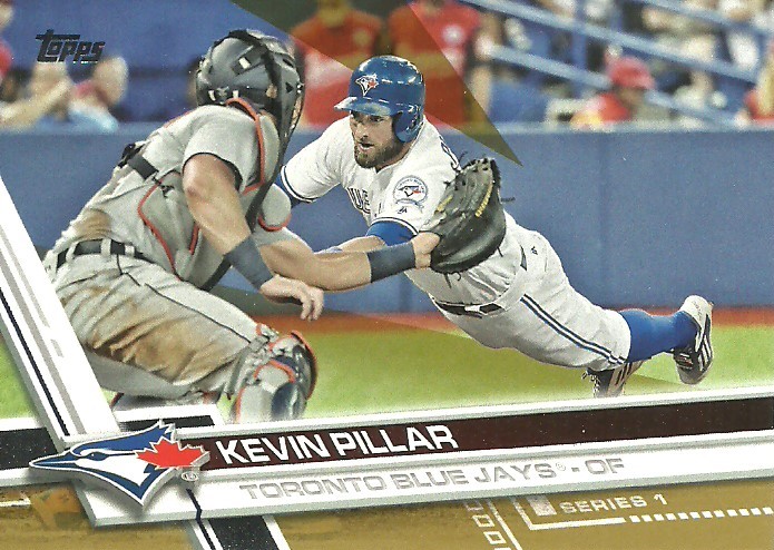
Favourite card of more than one player..
This may be a cheat, but really my other favourite will be featured in the post later..
This is from the 1993 Donruss Toronto Blue Jays Great Moments set put out by McDonald's.
Now, onto our Feature Presentation.
I'm sure this has been covered elsewhere, and probably better than I can, but I want to look at the difference between the Topps cards and the O Pee Chee cards from 1977 for the Jays.
1977 was the birth of two new teams, the Toronto Blue Jays and Seattle Mariners. Toronto finally gets a team after failing to convince the San Francisco Giants to move to the Great White North.
Topps treated consumers to a bunch of airbrushed blue and white, some very badly done. OPC on the other hand, actually had mostly shots from Spring Training. There were still some badly airbrushed logos showing up, but not to the extent the US market received.
The top one is the Topps card. The Bottom is the OPC.
In 1976 Ashby was with the Cleveland Indians. In the OPC version, you have the Jays uniform showing, though the light blue stripe seems to vanish part way around the neck. The helmet doesn't look touched though.
Here the top one is the OPC version while Bailor shared a card with three other players. In this case, it looks like OPC just took the Topps photo and zoomed out. The bird logo is the same, and if you look, Bailor doesn't have the "Blue Jays" name on the uniform. The shirt is blank.
Top is OPC, bottom is Topps.
First, I must mention the aviator shades.. Nice....
The OPC card looks like it was taken in Spring Training. The Topps card, I have to say, has one of the better airbrushed logos. Some of them are distractingly bad, if that makes any sense. It's interesting. Hartenstein last pitched in the Majors in 1970 for St Louis, Boston, and Pittsburgh. 1976 was spent in Hawaii. What a change from 1976-1977...
The top one is the OPC, while the bottom is Topps..
This one is an interesting one. Both are airbrushed. It looks like it's almost two attempts at it using the same photo. However, the one used in the OPC card is less washed out.
Really the two ways I can tell them apart are more definition in the dark blue portion of the logo and the fact his first and last name are stacked rather than in a straight line.
Top is OPC, bottom is Topps.
It's funny.. The Topps one was likely taken in 1976 when he was with the Tigers. In the OPC photo, he's got the 'stache. I would also hazard a guess to say that the OPC version was taken in Spring Training, since the logo and uniform look almost "real"
Top is OPC, Bottom is Topps.
In 1976 McKay was in Minnesota. The airbrushing in the Topps card makes it rather obvious, since the hat is too dark for the Jays colours and the collar stripes aren't that dark either.
The OPC shows McKay in a posed swing that is missing from current sets (aside from Heritage)
I'm kind of interested in finding out more about the people in the background. It looks like some people there to watch a Spring Training game, but just not very populated..
In 1976, Doug was a Ranger. In his tiny photo, you can tell based on the uniform. The logo was tiny even for the photo.
The OPC above the Topps card has Ault looking like he's staring at someone trying to give him directions.
In 1976 Gary Woods was a member of the A's. While the hat logo looks weird, it's probably one of the better airbrush jobs done by Topps.
OPC gave Woods his own card and he is shown in a posed follow through in front of empty stands. One thing about the late 70s and early 80s for minor leagues/Spring Training: The facilities don't look much different than some high school fields. (Really some were high school fields...)
In 1976, Jim Mason was a member of the Evil Empire... I mean New York Yankees. Again, Topps just airbrushed some white onto the front panel of the cap and a deformed logo. The hat otherwise is too dark for the Jays.
The OPC photo looks like there's a few more people in the stands, at least..
If my pick for the Card Challenge is a cheat, here's my other option.. Can't go wrong with a Dawson rookie.
In 1976, John Scott was in Hawaii. Again, what a change a year makes..
The logo again is distracting.
O Pee Chee found John clean shaven and squinting into the sun, it looks like.
The Topps card here is interesting. You have a Jay for Spring Training (Hooten was released before the season started) and a future Jay that didn't want to go North. (Lemongello was not impressed about coming to Toronto, asking if we "Spoke American." After a horrible partial season, he was sent to Triple A and didn't return to the Majors) as well as a Hatless Mariner.
Again, OPC gave Hooten his own card, and he looks about as confused about it as some people receiving this card in 1977 may have been.
In 1976, Mike Willis played for Baltimore's Triple A team in Rochester. It almost looks like three of the four photos were airbrushed here. Only Krukow looks untouched. I base this on the fact that the Jays logo on Willis' hat is almost imploding on itself, Wheelock's trident logo looks oddly positioned compared to the hat, and Otten just looks completely faked..
I really don't know what to say about the OPC card. It's just a nice card. Players milling about in Spring Training. A Posed shot of Willis. Just nice...
Otto Velez was a minion of the Evil Empire as well in 1976. The airbrushing on the hat is probably the best one of all Topps' efforts for the Jays. That said, the hat itself is too dark and the road greys for the Yankees are on feature.
The top one is another Jays photo at Spring Training. I do notice that some of these photos may have been touched some, since the light blue collar stripe seems to disappear halfway around.
In 1976, Pete Vuckovich was a member of the White Sox. I'm trying to decide if they touched the uniform top at all.. I don't think so. The hat again is very distracting..
Another posed pitching motion, this time it looks like on the outfield grass. I do like the pose though.
The final card I'll compare is a bit of a tough one to compare.
The Topps card shows Hartsfield with his coaching staff. Again, a bunch of bad airbrushing for the hats. Some of the coaches logos look again like they're trying to shrink into singularity.
O Pee Chee gave Harstfield his own card and a separate one for the coaches. (I Don't have the coach card... Yet....)
In both Hartsfield looks either deep in thought, or annoyed someone is bothering him..
I hope you enjoyed the look at the 1977 cards