
I'm going to start by saying I love the 1987 Topps set.. I completed it, and am working on completing the 87 OPC set.
I thought it was cool when they used it in 2017 as an anniversary of the set.. But now... It seems like it's in a set every year.. And I want to show you something as an illustration for how frustrating it could be..

We start with Jose Berrios. Not too bad.. Nice action photo. I do kind of miss the baseball stitching on the logo, but I know they've gone to this logo for the last couple years, so.. Whatever..

Next we have a Bo mid load up for a swing. Lots of blue in here, with the blue background and the blue uni, but again.. Whatever..

A shiny.. Vlad Jr makes an appearance as a chrome refractor kind of deal. The only debate for me really is if I want to keep it at one or if I want to try for a second to put into my Canadians binder..
Ok.. Here's where it gets fun...
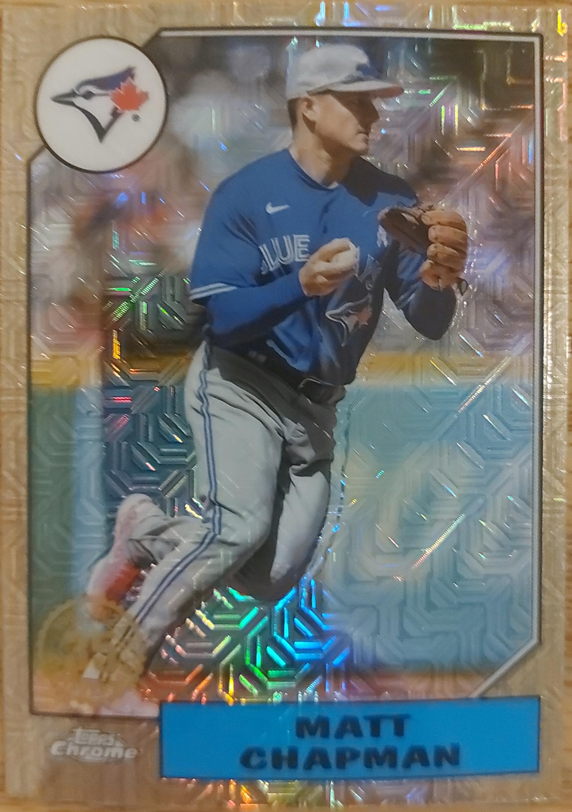
A Shiny Chapman.. Easy enough to distinguish.
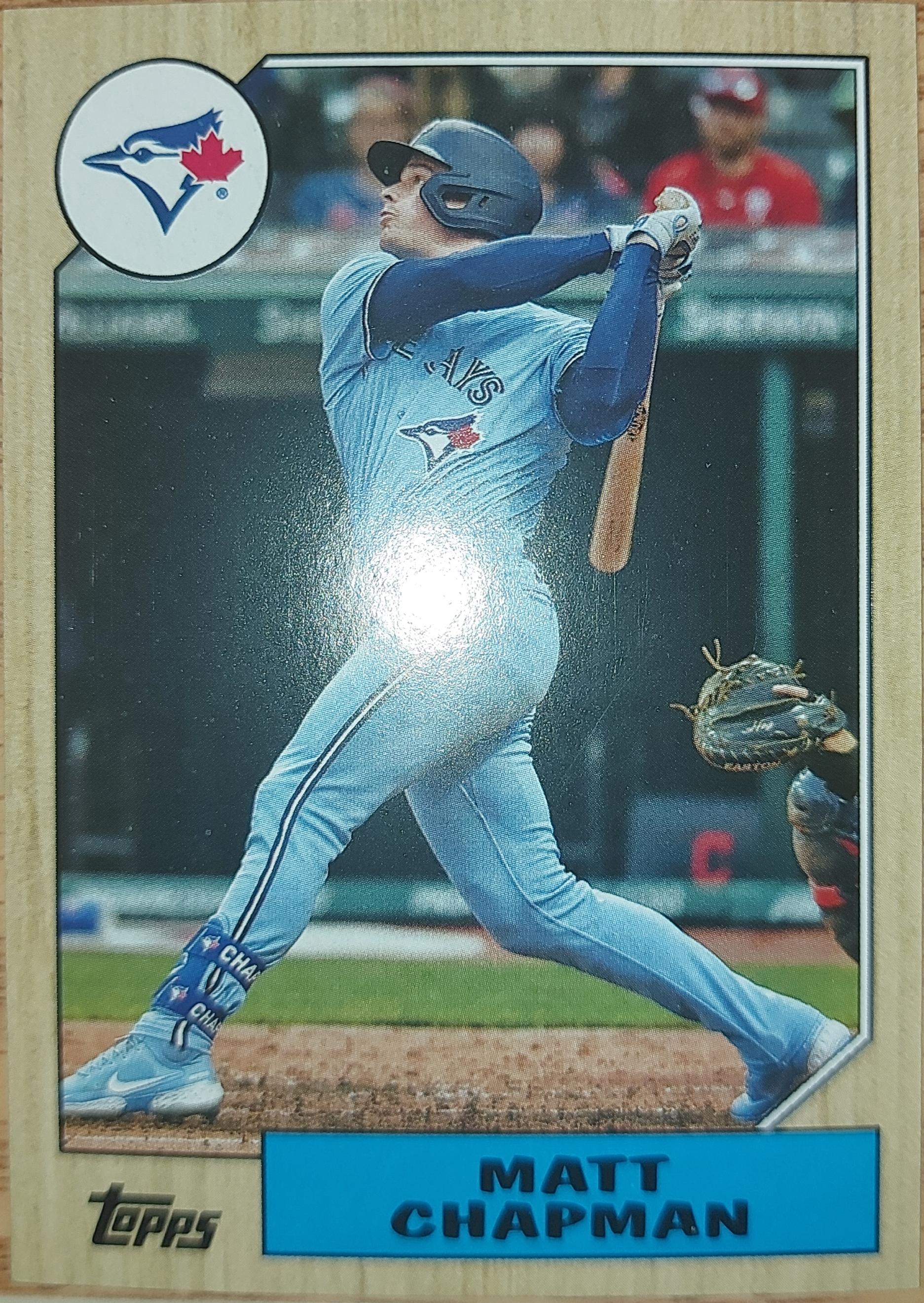
Here we have another Chapman...

And what's this? A THIRD Chapman??
So I have three Matt Chapman cards in the same design, but different photos thankfully.. Do I know what inserts these are from? Nope..
I think Topps has gone well past the point of beating this horse dead.. They've beat the horse so badly it stopped bleeding and everything is just a slurry...
I wasn't big on '87 in the first place (I know, I'm well within the minority), but the way that Topps has run it into the ground in the past decade is just depressing. On your Chappie's - The first is from 2022 Update, found in the Chrome Silver packs. The second is 2022 Archives. The third is the normal 1987 Anniversary insert from 2022 Update.
ReplyDeleteThe 1987 Topps design will always have a special place in my heart - it was the first set I ever completed. That being said, Topps is doing everything in its power to make people sick of it...
ReplyDeleteAgreed.
DeleteI suspect that this is a trend that will not be ending anytime soon.
ReplyDeleteI think you're right unfortunately
DeleteI too love the 87T design... and agree that Topps needs to chill on using the design on an annual basis.
ReplyDelete